In December last year, I and two other designers from Open Lab, Laura Prescott and Finlay Brazier, spent a month reviewing the design and structure of the Govt.nz website. As recent graduates from Massey’s School of Design, and reluctant users of government websites ourselves, we were excited to have a chance to work on a project that could make navigating government much easier for a lot of people.
The brief
Our initial brief was based around the goals of Govt.nz: to design and deliver information that meets user needs, to be an authoritative source for cross-government information and to promote open and transparent government. Underlying all of this was the vision of making it easy for people. Existing feedback and data from the site suggested some issues for us to look at:
- it didn’t look like a government site, so people were not convinced that it was legitimate
- it was visually unappealing
- it lacked a distinctly 'New Zealand' feel.
This first redesign addresses these issues: it’s a visual makeover of the existing content. However, we also found navigation and structural issues when we analysed the site and some larger changes are coming soon to deal with these.
Our approach was user-centred design, which is a way of putting people in the centre of our thinking. We were thrilled at how much commitment the team were already showing to this approach, and their willingness to let us run loose with our ideas.
We began by analysing the site, using the personas from the R10 Blueprint to imagine how the site might be used by people at different times. What was it like to find out how to register a death? What about finding out how to convert a driver’s licence? What kind of frame of mind would people be in while they were doing those things?
Once we had identified some needs, we used low-fi wireframes to try out many different layout combinations, then refined them, gradually adding colour, fonts and imagery.
The facelift
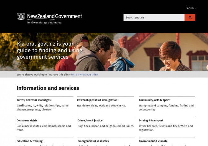
The visual design changes are based on a clear hierarchy, strong contrasts and plenty of white space. We adopted a black banner with a white logo, as most Kiwis identify with the iconic white-on-black silver fern, and because other sites with a strong New Zealand brand such as newzealand.com use this colour scheme. Our other colours, a brick red and navy blue, reference the New Zealand flag (we’re hoping it doesn’t change too soon). The crest was added to ramp up the authority the site evokes, and we also included a banner image to balance this formality with friendliness.

The new visual design of the homepage with banner image.
Although the banner image takes up real estate on the page, user feedback was resoundingly positive. Its presence is also justified by the ‘Halo Effect’, a phenomenon where a positive first impression means users’ overall experience of something has a positive bias, which means more forgiving users. Thanks to NZ Story for their fantastic kit of NZ images and videos.
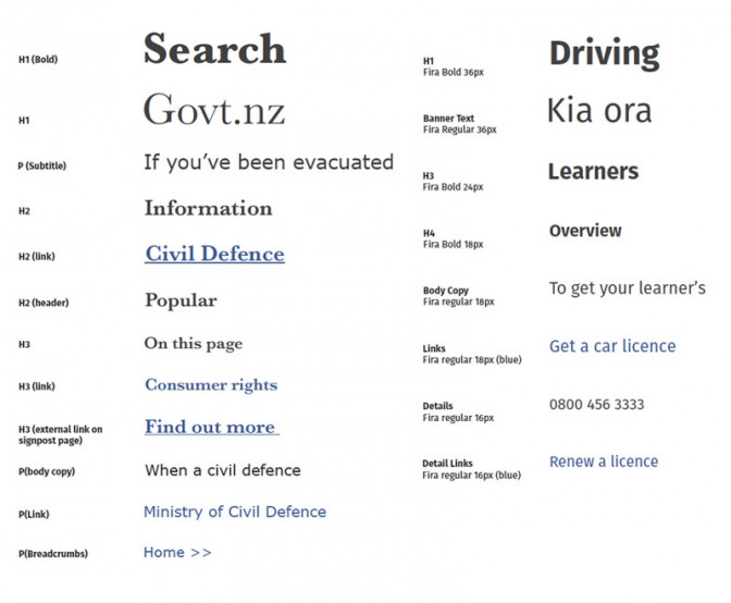
The font we chose was Fira Sans, an open source font with a human feel and some nice character quirks at larger sizes. We took a tip from Gov.UK and used just one font throughout the entire site to reduce visual complexity.

The typographic hierarchy before and after the redesign. Levels of hierarchy were removed to simplify the focus of each page.
Getting it in front of users
Once the designs were refined, we made them into something that we could test with users. Using a prototyping tool called InVision App, we made our JPEGs into a model that users could click through. Users were asked to think aloud as they found out how to replace a driver’s licence they had lost or find out if they could extend a student visa. Arlington Apartments Computing Hub kindly let us sit in for a day and we showed our designs to some of the city housing residents there.
We had great feedback about the look and feel of the site, people described it as “efficient, warm and easy” and “friendly, like New Zealand, official looking”.
Watching different people interact with the prototype, it became obvious how difficult it was for some users to find information. Things that were immediately apparent to many users were invisible to others. One surprising thing was the range of places people thought information might be found. For example, one man thought information about replacing a driver’s licence might come under ‘Community, Arts and Sport’ because someone driving a van for their local church community would need to know. Many people were inclined to look under ‘Police, Crime and Justice’ for the same information as well as ‘Driving and Transport’. This stressed the need for flexible content.
Low-literacy users
After seeing the difficulty people were having, we looked at research around how low-literacy users read on the web. The Adult Literacy and Life Skills survey conducted by the Ministry of Education in 2011, reveals that 40% of the working population in New Zealand are classified as ‘low-literacy’. In addition to this, studies from the Nielsen Norman group found that this audience process websites in radically different ways from more literate users.
Instead of scanning pages for relevant headings or links, they read through text line by line, which was exactly what we had seen in our testing. Low literacy users have a narrow field of focus when reading, and often miss peripheral information. On top of this, they are disinclined to scroll, as this breaks their concentration and they lose their place visually.
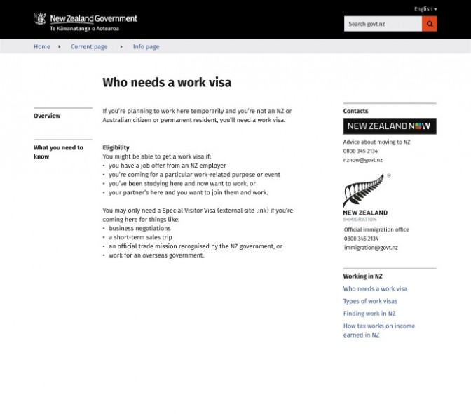
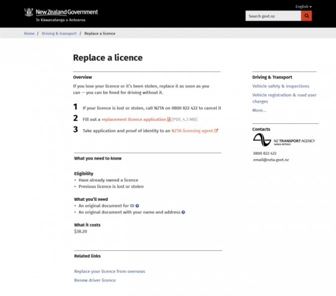
We revisited the design, and made some changes. We combined almost everything into one column, and moved all the important information and links to the top of the page so that users didn’t have to scroll. We went back and tested, and found that a link at the top of the page worked even better than a big red button at the bottom – for all users, not just lower literacy ones. Some of these changes you’ll see in the next release, and some are coming soon along with a content review.

Before testing.

After testing, optimised for lower literacy users.
What’s it all for?
When we began the project, we questioned the purpose of the site. Looking at it with fresh eyes (and without knowing the business context), it was a little unclear whether this was a directory, a government mothership or a stop-gap. In an early test, we measured how many clicks it took to get to information about the legal paua size in New Zealand. Through Govt.nz, it took five minutes and 16 clicks to get to the information. Using Google, it took one minute and five clicks. This showed that we really didn’t need to be building a ‘government google’ — Google was already doing that job well.
Through discussion with the team and our own observations, we realised that where Govt.nz really adds value is as a guide through government information and processes. The fantastic work that the content team has been doing with plain English, the cross-agency information, and design for accessibility would all make it easier for people doing the hard stuff. With that in mind, we shifted the directory elements (Services A–Z and Government A–Z) and said “less like a phone book, more like a guide dog”.
The other opportunity for Govt.nz is to act as an exemplar for inclusive design, including design for low literacy users. We love thinking that our work will inform future government sites, and hope that accessibility and usability will be the default for public sector web design.
There’s plenty more to do, but it’s great to see the visual design changes about to be released. As always, we’d love to hear your thoughts and questions below, or come to the session we are holding in a couple of weeks.
An open invitation
Join us for a government web community session to find out more about visual design and the process we went through. In the session we’ll cover off the main features of the design, what challenges we have for low literacy, and what this means for us going forward.
Simple not simplistic…. How designing for low literacy helps everyone. Under the hood of the Govt.nz redesign.
When: — Tea and Coffee, Presentation 12pm - 1pm
Where: Poutama Ruma Room at Archives NZ, 10 Mulgrave St.
RSVP: Sarah.StJohn@dia.govt.nz


